An image of a laptop, phone and tablet, all with the same screen displayed, visualising the home screen of the app.

Overview

Keeping staff safe while they travel overseas when an incident (natural or otherwise) happens, was not an easy task. Reviewing the old methods and behaviours of staff, I made it simpler to submit travel information, as well as making it available to the right people at the right time.

The solution

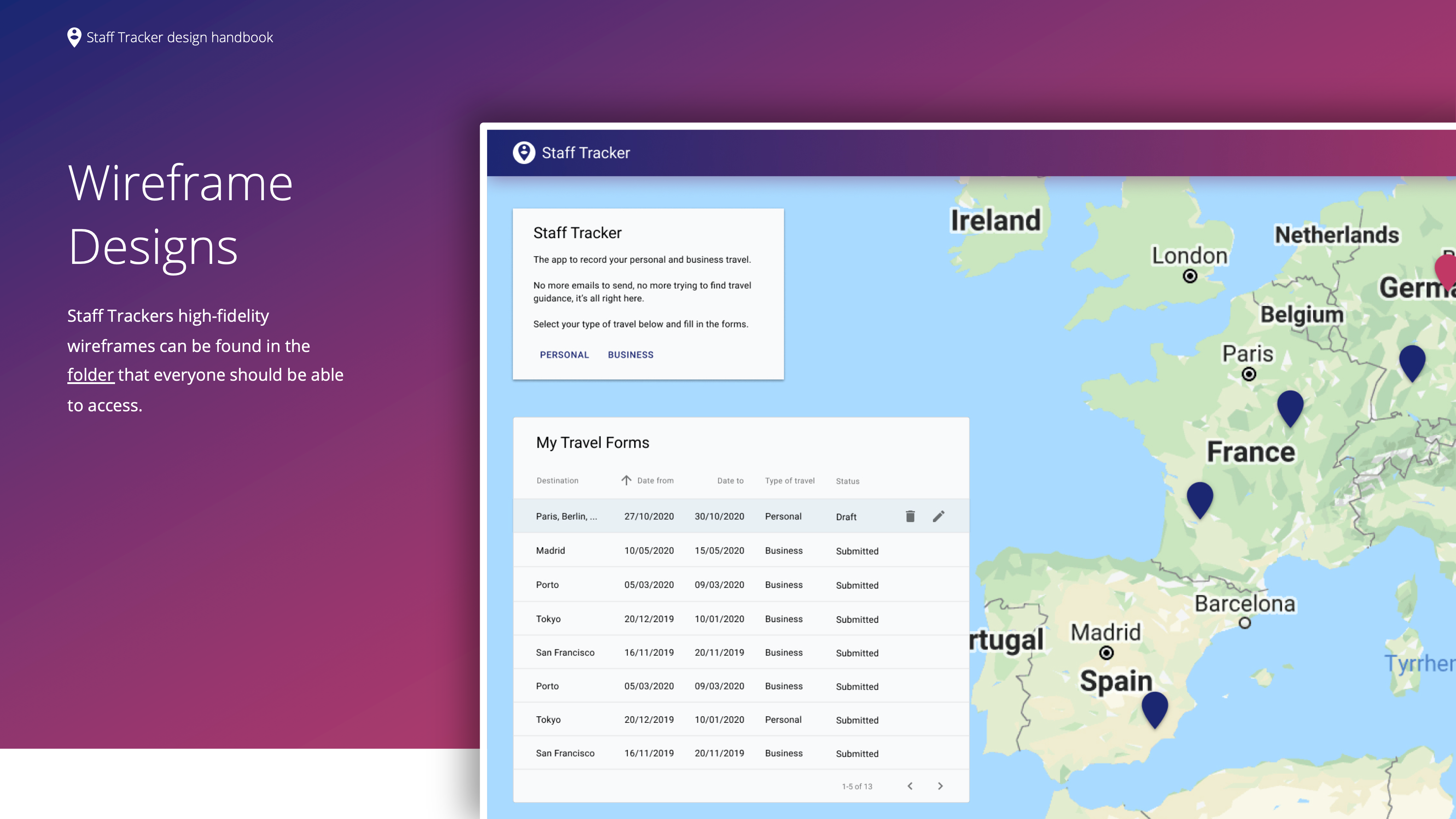
Collaboratively created an accessible and inclusive app, benefiting all user groups. The app visually displays information, making it easier to prioritise communication of safety alerts. It also reduces the time to submit travel information from 15 to seven minutes, which serves to increase adoption.

My role

I drove the idea and engaged with senior business process owners, as well as getting buy-in from senior software management. Researched user needs by practising user-centric methods. Worked with developers to understand constraints and helped scope their work. As a team, we collaboratively designed and iterated upon wireframes.


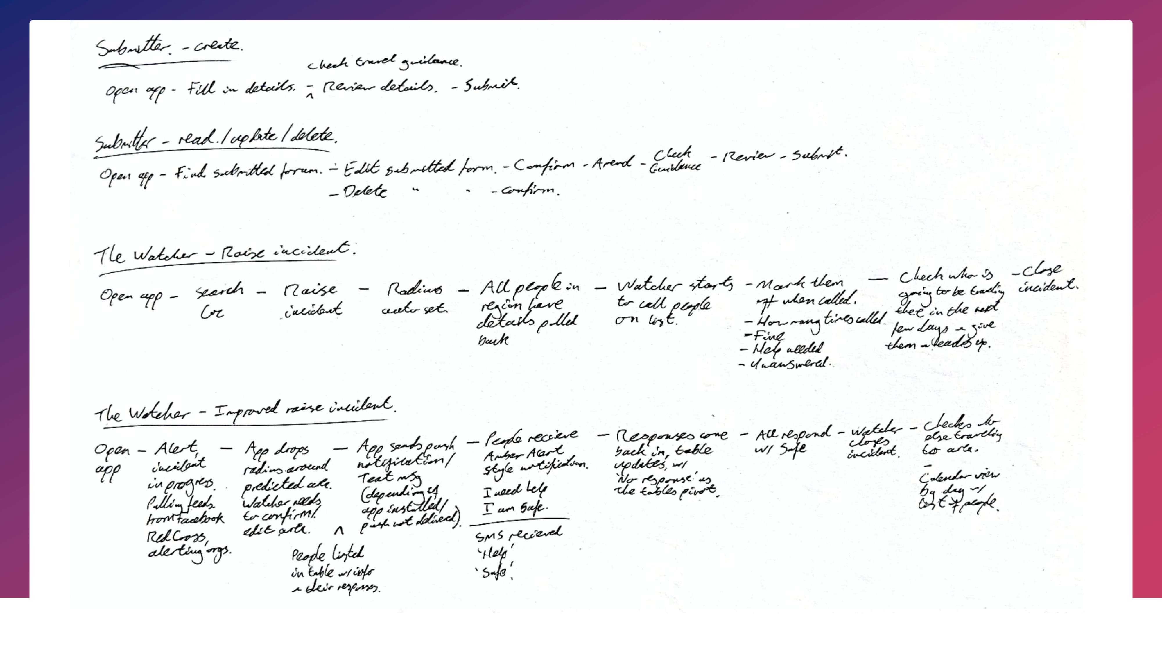
Imagine this. You have a workforce all over the world and you have a responsibility for their safety. People are travelling out to new positions in other countries for work, you have people going to visit overseas organisations or government departments and people are simply taking a well-earned holiday.

An incident happens, natural or otherwise. How do you know who is where? How do you know who to contact first? How do you keep track of who you have contacted and what they said?

Spotting issues in the process, I saw that it could be improved. I challenged the business to see how we could change the current process.

A quick note

To comply with my non-disclosure agreement, I have omitted information in this case study. All information is my own and does not necessarily reflect the views of the office.

🤔 The challenge

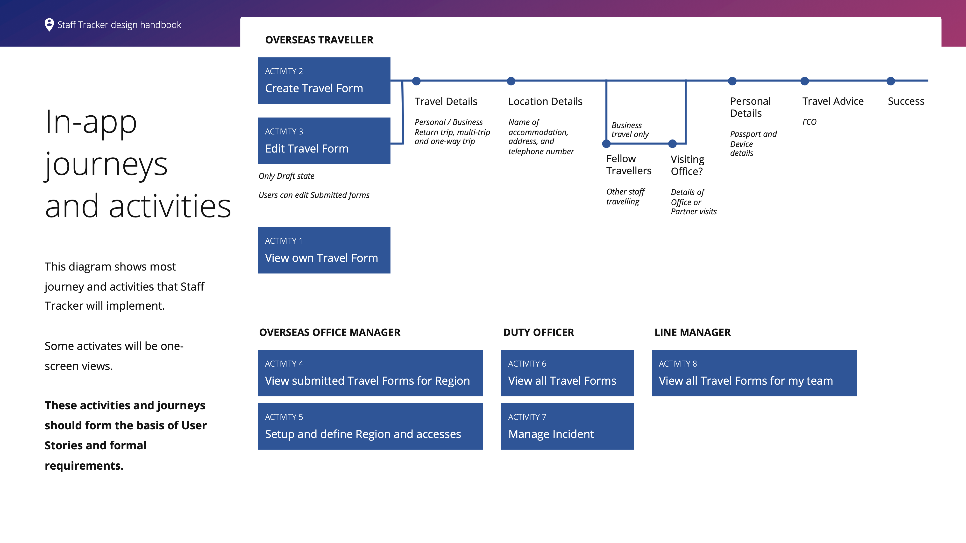
Before you travel you need to complete a Travel Form. This Travel Form is completed in an app, exported as a file and then emailed to teams. The Travel Form is used by:

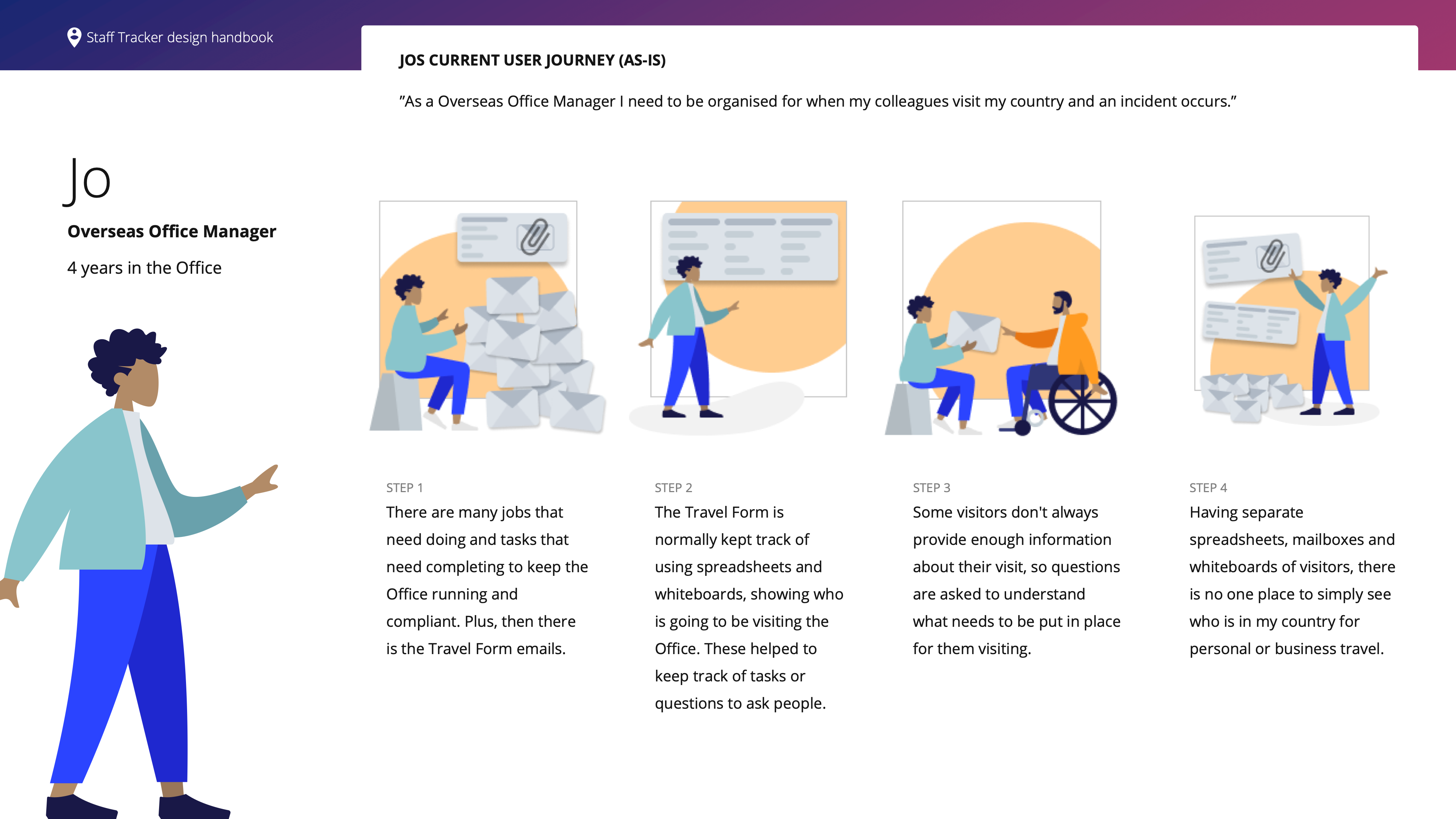
    • Overseas Office Managers to know who is coming to the Overseas Office.
    • Overseas Office Managers to know who is going to be visiting Partner organisations while visiting.
    • Duty Officers to know where staff are while travelling, to ensure their safety.

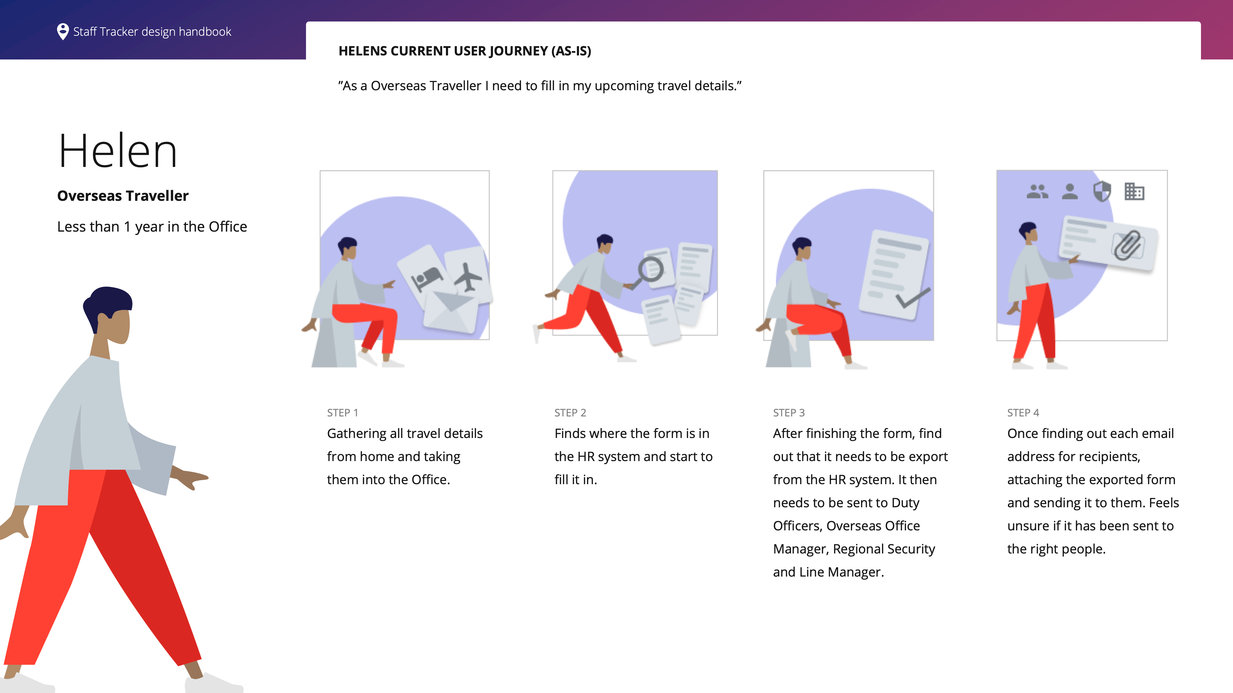
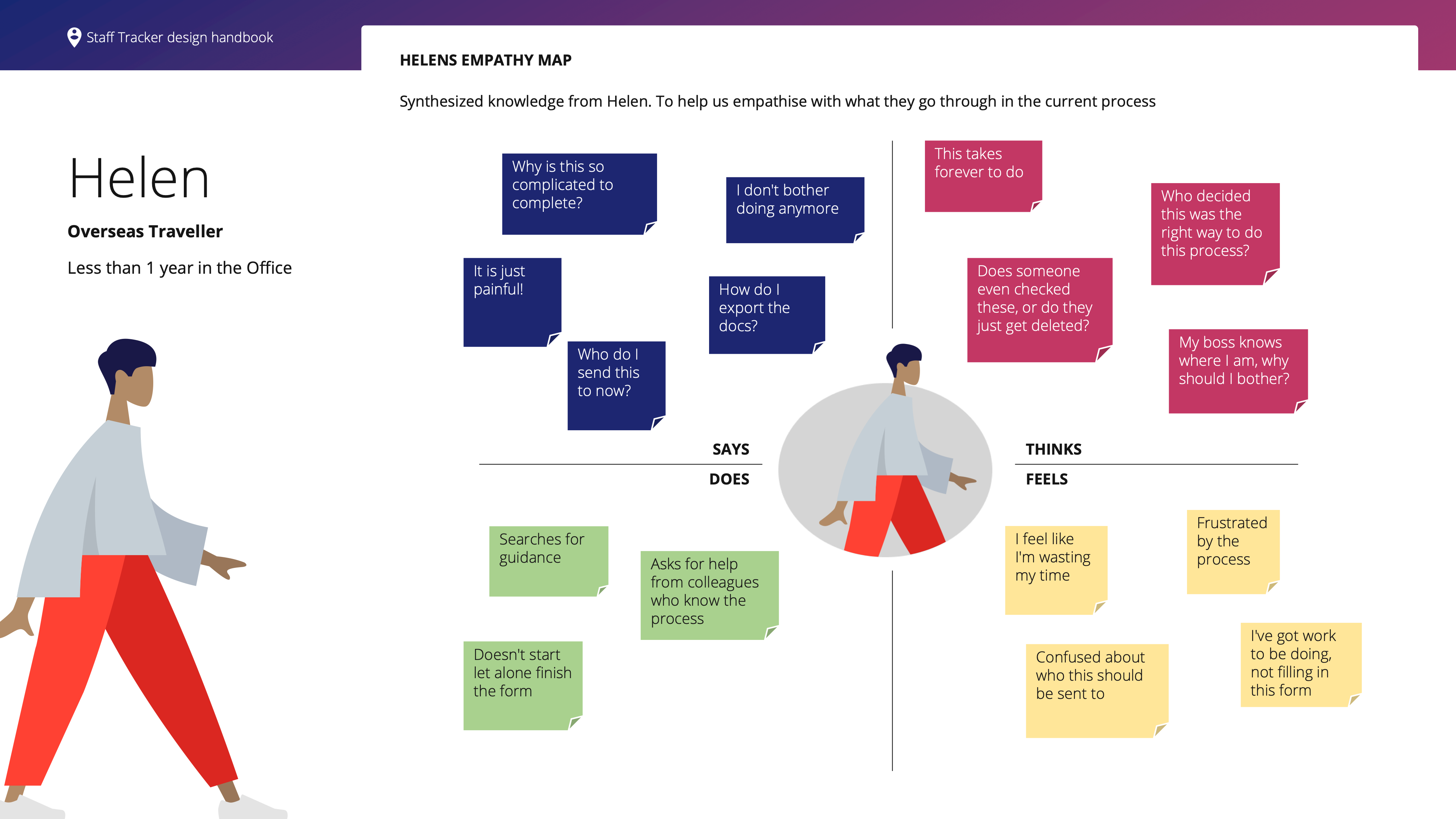
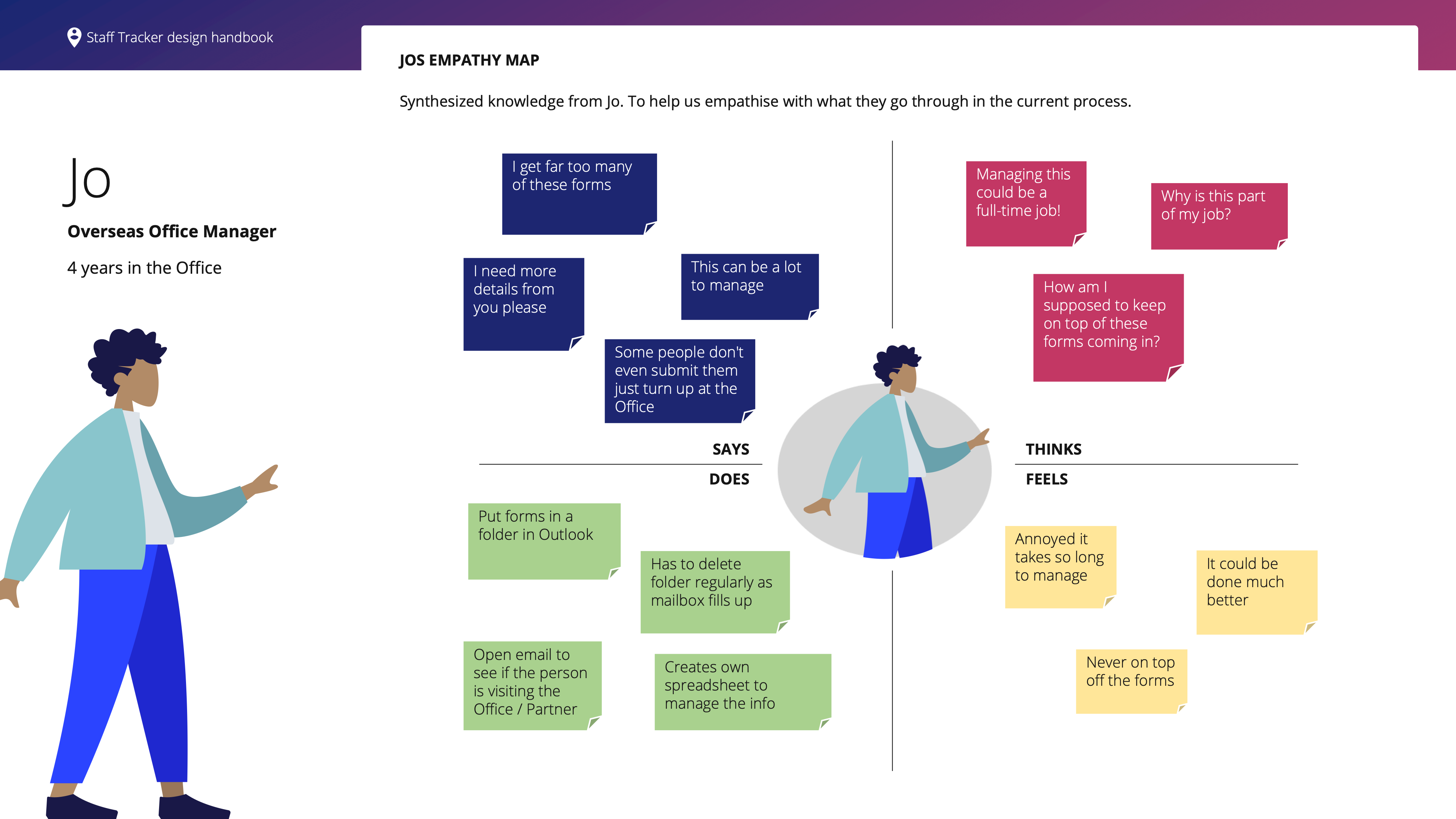
From personal experience I found that the current Travel Form wasn't a straightforward process to complete or share with relevant teams. I don’t believe the creators of the process wanted to make it difficult but it clearly evolved over time to where it is now.

Rather than sticking to the status quo I decided to see what could be changed.

🥅 High level goals.

To be able to measure if I was moving in the right direction, I set out the below:

    1. Increase adoption of the Travel Form.
    2. Increase submissions of the Travel Form with completed and up to date personal information.
    3. Decrease the time for completing the Travel Form.
    4. Stop Travel Forms being sent by email.
    5. Have one source of truth for the Travel Forms.
    6. Work with engineers to scope out the work involved to pitch to senior leadership.
    7. Pitch the concept and business case to senior leadership to replace the Travel Form.

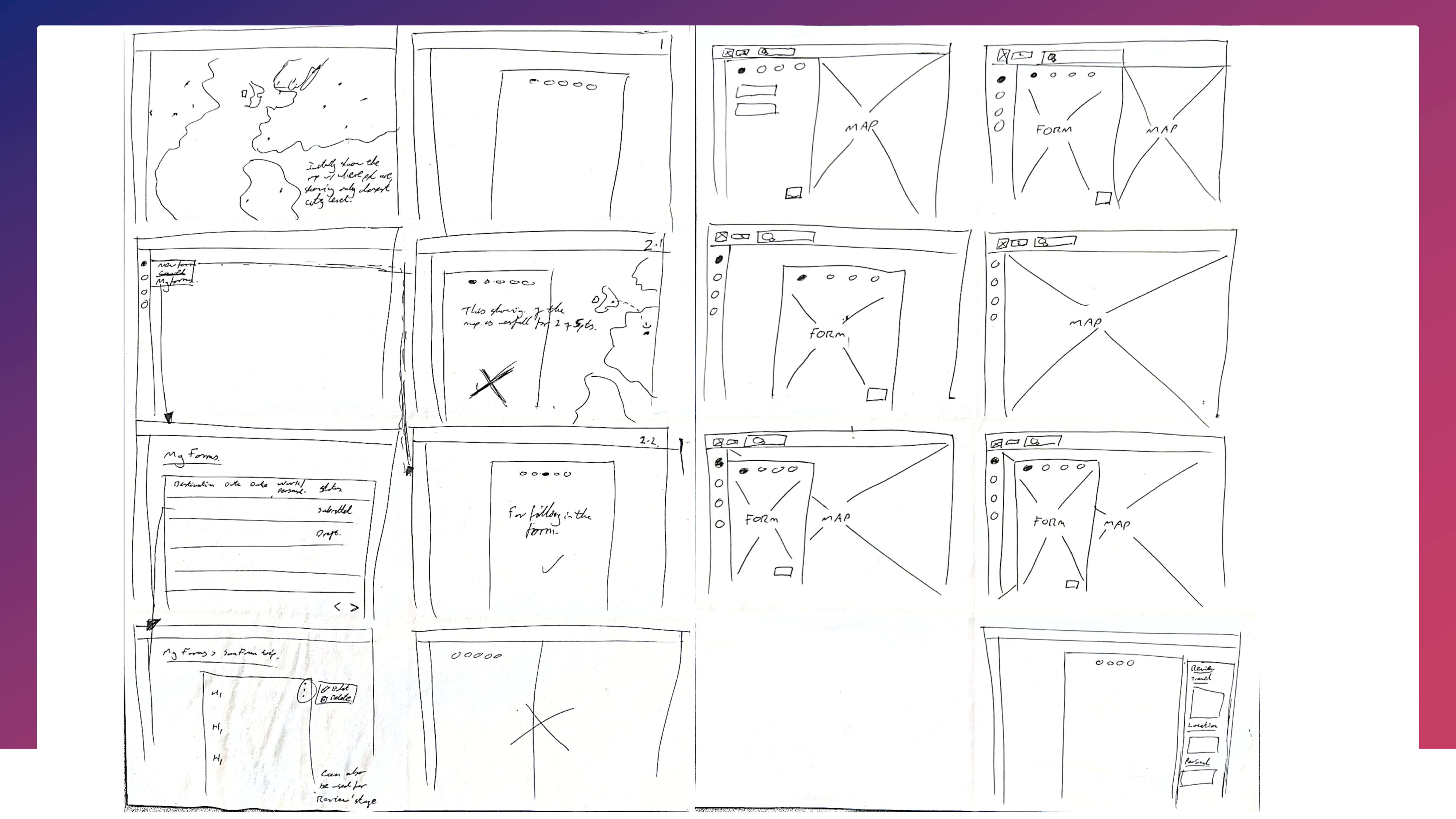
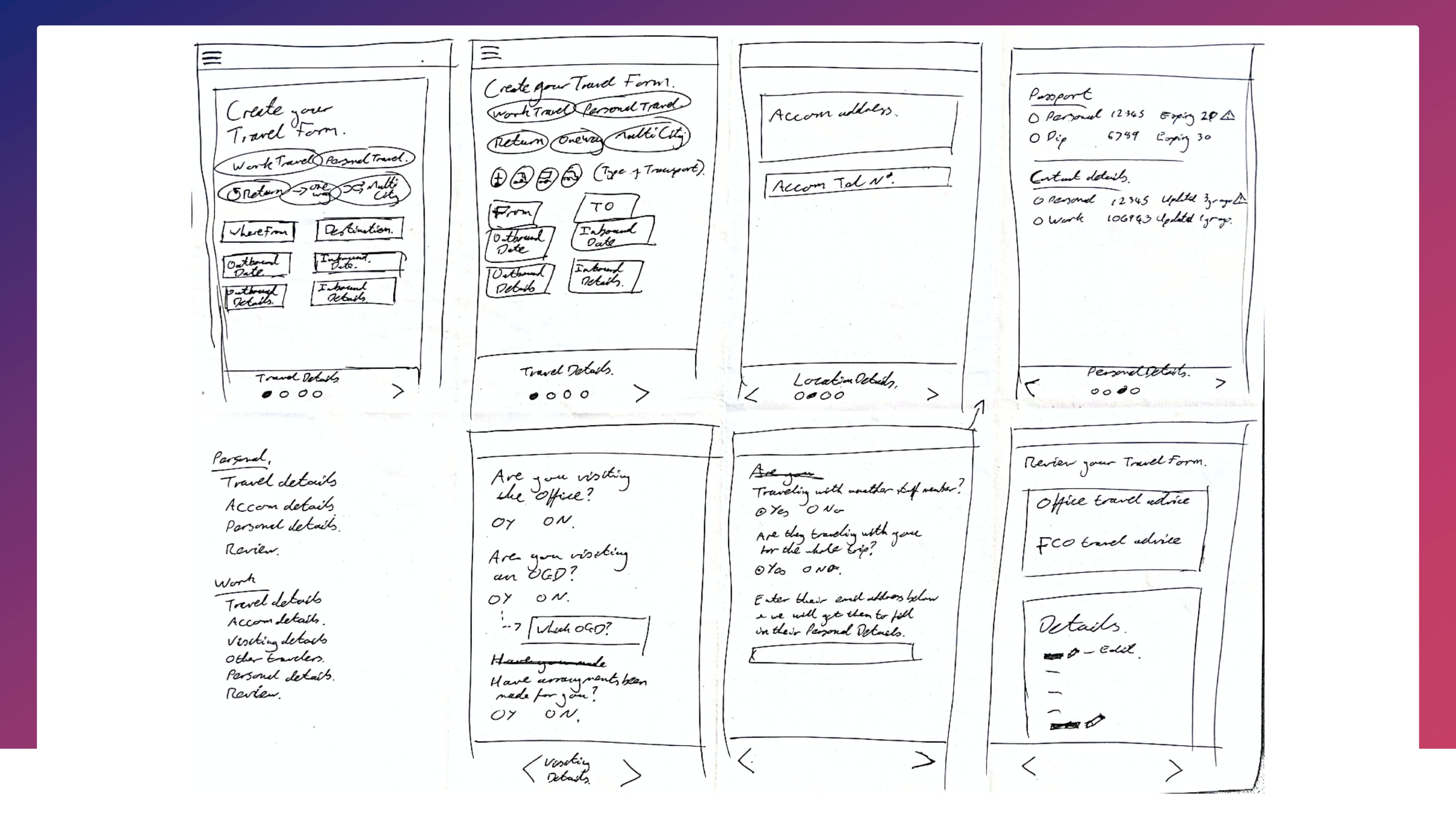
I started with the question of "How might we make this process less complicated?".

With the upcoming products in the road map, I saw benefits to doing this work, from differing points of view. These included:

    • Enabling the data collected to be interoperable between different systems. 
    • A simplified process for Travellers.
    • A more straightforward way to manage who is visiting the Office for Overseas Office Managers. 
    • One source of truth for Duty Officers.

As this work was not requested for by the business, I knew this self-started idea would be a challenge. Mainly to change a well-established business process, though one that was not adhered to.

The idea became a commissioned piece of work and is in development.

🎛 My role

I lead the Product Design of the app. From finding process owners, stakeholders and software management buy-in. I collaborated with the Product Owner, designers in the team and software developers.

My main tasks were

    • Stakeholder engagement and management.
    • Researching the process and user insights.
    • Pitching for two weeks of a cross cutting team of developers.
    • Collaboratively designing the app.
    • User tester with the user groups.

🎨 The process

Discovery

I was able to coax some help from my colleagues in the design team to research with me. This consisted of facilitating user centric research workshops, 1:1 interviews, analytics analysis, watching how people complete and then use the Travel Forms. We considered three user groups:

An avatar of Helen, an Overseas Traveller

Travellers

Staff travelling for personal or business reasons.

An avatar of Jo, an Overseas Office Manager

Overseas Offices Managers

Staff that have sight of everyone coming to their country. If a Traveller is coming to the overseas office or needs visits arranged to overseas organisations, it is the Overseas Offices Managers job to organise and book in the Traveller.

An avatar of Gordon, an Duty Officer

The Duty Officers

A 24/7 staff member who ensures staff safety if an incident occurs.

Compiled with the team, there were several assets created based on the research:

  • Empathy maps
  • Personas
  • ‘As is’ journey maps
  • User needs statements
An image of Helen's current User Journey illustrated in a brief storyboard.
An image of Helen's Empathy Map. Illustrating the high-level issues Helen faces.
An image of Jo's current User Journey illustrated in a brief storyboard.
An image of Jo's Empathy Map. Illustrating the high-level issues Jo faces.

Design

Drawing out the flow for the app, I asked the team for their feedback. Everyone had differing ideas of what would work best. To get to the bottom of it, we had a session to work through the flow of the app. Numerous sketches and scribbles later, we came out with how all the users could flow through the app easily.

An images of different flows through the app based on different user groups.
An image from the Design Handbook, illustrating the different flows through the app, an evolution from the sketches.

I pushed on to do an ideation workshop with the team. Doing the sketch, elaborate and voting on the concepts. Ensure that we were designing for accessibility and usability from the start.

Sketches of the Create a Travel Form process for a Traveller, iterating on different perspectives.
Taking into account the different screens a Traveller would need to go through to create a Travel Form from a mobile point of view

User testing was carried out with the three user groups, to ensure that it was going to work for them. This also has the added benefit that there was no development time wasted reengineering later.

The user testing highlighted points around language, along with areas that could have features added to make the app more usable. 

This was mainly around the Overseas Office Manager view. Being able to see a snapshot of this weeks and next week's Travellers, along with who needs to have actions carried out, for them.

Delivery

The wireframes went through iterations with the product owner, which were released to the developers once signed off. A set of wireframes per user group were introduced to the development team, stepping them through and fielding their questions.

A developer handoff guide was created to bring people up to speed. This included the research, flows through the app, colours, typography, iconography and links to all the assets.

An image from Design Handbook, containing information about Accessibility considerations and Best Practices.
An image from the Design Handbook, around the Visual Styles within the app including colours, typography and iconography.
An image from the Design Handbook, with a picture of the Homescreen of the app and a link to the wireframes.

Working alongside the development team, I encouraged them to understand why a design decision had been made. Teaching accessibility and usability standards along the way.

🧗 Challenges

Commitment

I anticipated that showing there was an issue that could be solved simply, the office would work with me to do it. I hadn't anticipated doing as much selling the idea and benefits to achieve buy-in from business process owners, convincing and coaxing senior software management, to have access to developers.


🎓 Learning: To understand if there is a desire and appetite from the business, before investing time, that could have been used elsewhere.

Communication 

This app was not part of a formal project and didn’t have a Project Manager. It was carried out more slowly with little to no resources until securing developer time. As there were only small updates each week, I didn't want to add another email to an already overburdened inbox of the stakeholders.


🎓 Learning: Keep stakeholders involved and informed of the status and progress being made, even if they’re only small updates. Stakeholders, especially those with owning many products, need to be reminded and given regular updates.

🚀 Outcome

Overall this piece of work was a challenge, here are the highlights:

  • Assumptions and hypothesis were tested 
    • Time to submit a Travel Form was reduced from 15 minutes to seven.
    • One single source of truth was created for the Duty Officers.
  • Convinced business process owners to buy into the concept.  
  • Brought senior software management around to seeing the benefits of working on the app.
  • Secured 15 developers full time for two weeks of dedicated work.
  • Integrated services were created, which had been previously de-prioritised in the backlog.