Preserving and elevating a vital sales asset through rapid redesign.
Wiredscore · Six minute read

Summary
Missed connections between Product and Sales meant that the Sales team would lose one of their most important sales tools.
A quick turnaround was achieved, and Sales could use their new and enhanced map.
Overview
WiredScore defines and certifies digital connectivity and smart technology in homes and offices on a global scale, aiming to make buildings better connected.
WiredScore ratings increase rental value for building owners, and attract tenants by having future-proofed connectivity.
Key takeaways
- 3 day turn around
- The old map was being deprecated.
The Sales team weren’t told. The map is their secret weapon. - Sales team found it just as easy to sell using the new map.
- Enriched the data that the map provided. Connecting each building to its factsheet.
- Brought the experience in line with the brand feel and the design system.
Team involved
- 1x Product designer (me).
- 1x Product manager.
- 2x Backend engineers.
- 2x Frontend engineers.
Responsibilities
- Research.
- Exploration.
- Visual design.
- Vision.
Timeframe
1 week.
The problem
The website was being upgraded. Part of the website holds a map of all the buildings that have, or are in the process, of being certified.
The map was to be updated down the line, however the Sales team used it on their calls with potential clients, using it in a way to highlight what the competition are doing within that area. Without the map, the Sales team said they’d close less deals and it was a key part in their pitches.
The goals
The business goals
- Create a v1 that could be released quickly, so that Sales could still showcase the local and global footprint of Wiredscore.
- Quickly iterate on future versions to be developed.
Building owner goals
- Have easy access to information that they can share with potential tenants.
Building to be potentially certified
- Want to see how they compare against the local competition.
- Understand what certificates mean.
- Be able to get in contact with WiredScore easily.
Potential tenants goals
- Enabling potential tenants to understand what a building has scored and how this might impact my business.
- See the extra details that tell me about the buildings connectivity and resilience.
- Understand what certificates mean.
My role
- Design and deliver a concept which could be incrementally built upon.
- Hear from the Sales team what the benefit of the map was.
- Familiarise myself with the three types of customers who use the map.
- Understand the time frame for this work from the engineering team.
The process
Understand the problem
With the map being used by the Sales team, I quickly learnt from conversations and watching recorded calls, how they used it and understood the value in illustrating the potential of a missed opportunity. Also, hearing and seeing the themes that customers brought up about the map was insightful as well.
Getting into the data to understand how our customers used the map was key here, as it helped to give a direction in what to prioritise from a viewport perspective.
Talking with engineering was also key to understanding what constraints we were working within. What information could we get onto the map, and where was this falling into their sprint.

Desk research of platforms using maps, showing selected items and filtering.
Getting the work done
Based on the analytics, the desktop view was prioritised over the mobile view. However, the iterations were made knowing that the desktop view would need to be responsive.
A quick bit of desk research into how other businesses use maps and how data is visualised and listed was helpful. However, rather than reinventing the wheel, we built on the map concept we already know how to use (Google Maps).
Simplifying the copy with the expansion into the Middle East was a quick win. This meant that even if English wasn’t someone’s first language, they could still understand the information.
Quickly sharing concepts with stakeholders for feedback and engineering to understand the feasibility and iterate upon this. Doing this async using Loom to discuss concepts and the rationale helped us move quickly.
Used the updated visual language and design system to ensure brand consistency, making it quicker for engineering to build.
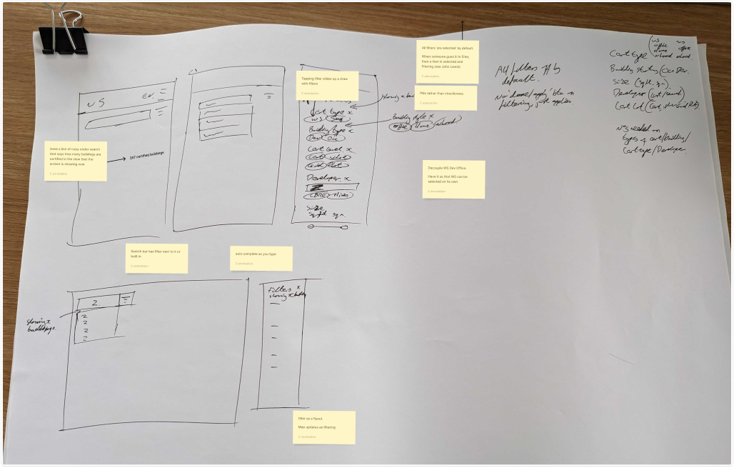
Quick scamps of thoughts and comments
Fast iterations on the building information draw and mobile concepts.
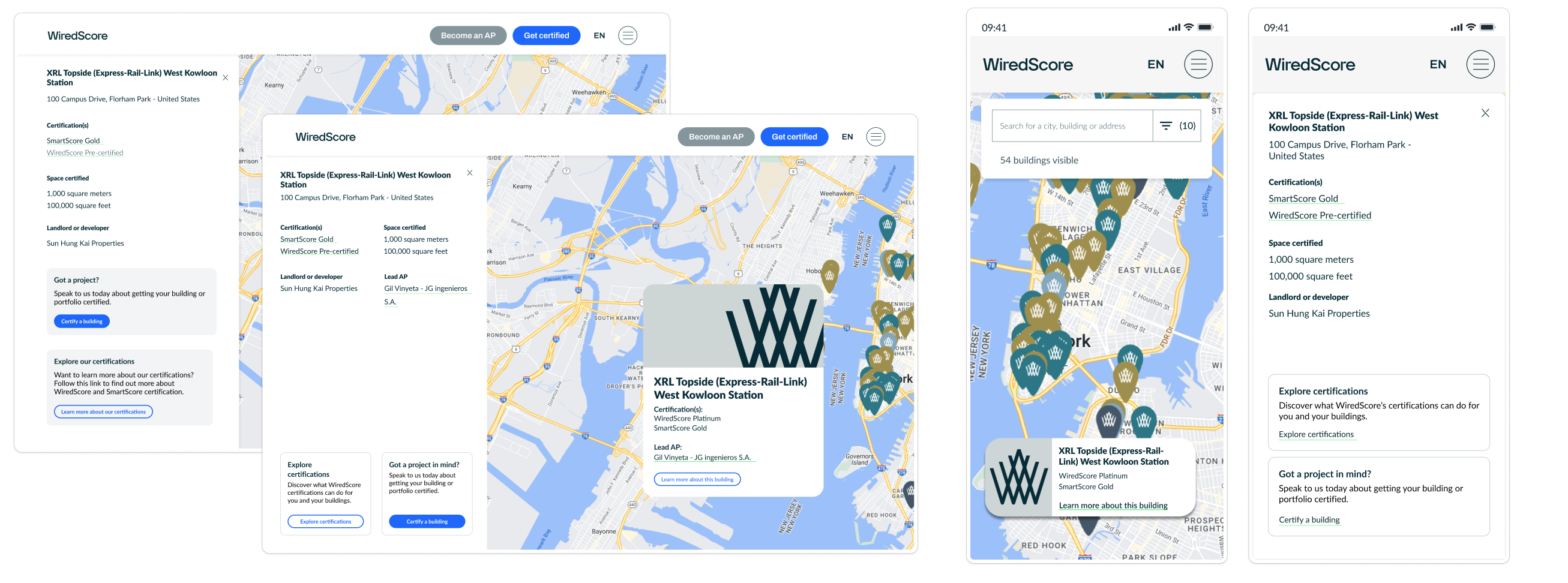
For a v2 release, we were able to include extra information the map:
- As WiredScore grew, more certification types were available, and the map needed to reflect this. With more information available, Being able to filter views was going to be of benefit.
- Brought in Neighbourhood certificate which had recently been launched. This was selling well in the Middle East region, so it was key to bring this to the map also.
- Once clicking on the building cards, to make them a little more interesting I thought of using an image of the building, rather than it just being copy.
A quick demo of the map and the interactions viewing different parts of the journey.
What the mobile view should be like.
Outcome
- The Sales team said that having the factsheet of the buildings available from the map was very beneficial. Again, this helped highlight other certified buildings in the local area as competition for prospective tenants.
- Added in an area to understand more about certificates and an inbound lead route.
- Engineering was able to release the v1 map, which had the same functionality, meaning that the Sales team could still use their greatest sales asset. Pitching to prospective customers without the map would have harmed conversion.
Challenges
There are not many challenges from a design or engineering perspective. It was more around understanding from the Sales team and how potential tenants use the map.
Getting lots of feedback in different ways made collecting and actioning everything a touch harder. Comments in Loom videos, in the Figma file, Slack and shouts from across the office. From this, I’ve learnt to specify how to provide feedback, which is in the design file, meaning everyone can participate in the same place.
When the filtering draw was open, I would have liked to consider a different interaction for opening the building draw.
Measuring the quantitative impact of the map being, rather than qualitative only. This wasn’t a priority and was descoped.
What would I have liked to include
The surveyors who certify buildings tend not to be well-publicised. There was an opportunity to increase their profile. This would give greater transparency about who has carried out which surveys on which buildings, increasing the potential for future work for the surveyors.
The animation of the building information / filtering draw moving in from the left-hand side needs work, so the content doesn’t grow to the size but is already set. Also, the size of the two draws are different. The maps’ extra releases were carried out after I had left the business.
Being able to collect data on the sales funnel from the inbound leads, to understand if this was bringing in extra customers.
Other cast studies
Transforming data insights into fundraising success for startup founders.
Outcomes:
- Dashboard viewed 1,500 times in its first month.
- Data download up 300%.
Simplifying regulatory compliance. From spreadsheet chaos to streamlined evidence management.
Outcomes:
- 7 hours saved per FCA request.
- One source of truth, rather than disparate data storage.
- A scalable app that continued to grow and provide value.
Transforming global staff safety. Building a better travel safety system.
Outcomes:
- Convinced business owners and senior software management to build the app.
- Secured 15 developers full-time for two weeks of dedicated work.
- The time to submit a Travel Form was reduced from 15 minutes to seven minutes.
